App Settings
Configure all aspects of your app: info, design, permissions, navigation, and assets.
Main Info
Main Info contains the core settings that define your app's identity. These settings are used when publishing your app and appear in the app stores, so choose them carefully. You can always update these later.
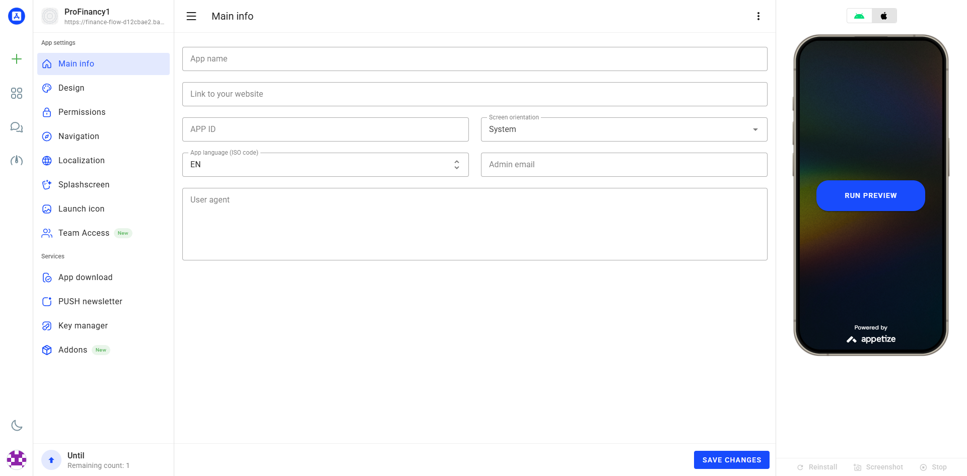
📱 App Name
Name displayed on home screen. Keep short (under 30 chars).
🌐 Website URL
Your website address with https://
🆔 App ID
Unique identifier (e.g., com.company.app)
📐 Screen Orientation
System, Portrait, or Landscape
🌍 Localization
ISO code (EN, ES, HE, etc.) for system messages
📧 Admin Email
Contact email for support
Click "SAVE CHANGES" after modifications. Changes update automatically in the simulator if running.
Design
The design section lets you control how your app looks to users. Choose a layout template that matches your website's navigation style, then customize colors to match your brand. Changes are visible immediately in the simulator.
Theme Settings
These options control the overall look of your app. Start with theme colors, then adjust the loading indicator and refresh behavior.
🎨 Theme Color
Primary color for navigation, buttons
📝 Title Color
Light or Dark text
⏳ Progress Indicator
None, Linear, or Circular
🔄 Pull to Refresh
Enable/disable feature
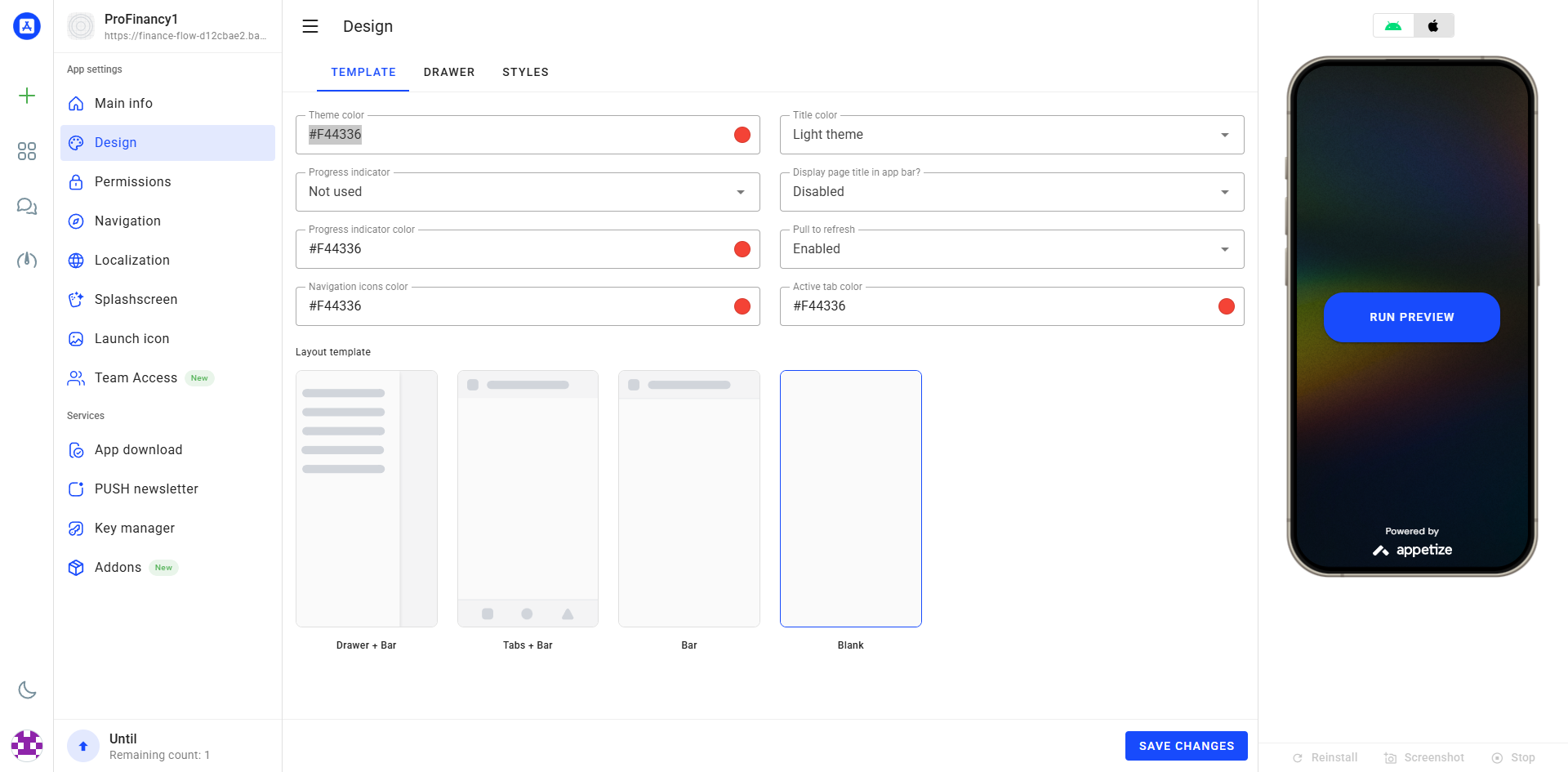
Layout Templates
Choose the navigation structure that best fits your website. Each template provides a different user experience and navigation style. You can change this later, so don't worry about getting it perfect the first time.
If your site already has clear navigation, choose a simple template (Tabs or Bar). If you want a menu with many sections, choose Drawer + Bar.
📱 Drawer + Bar Recommended
Ideal for content-heavy apps with multiple sections. The side drawer provides easy access to all navigation items, while keeping the main screen clean and focused.
Best for: E-commerce, News, Catalogs📊 Tabs + Bar Popular
Perfect for apps with 3-5 main sections. The top tabs provide quick switching between sections, while the bottom bar offers persistent access to key features.
Best for: Social Media, Dashboards, Services⚡ Bar
Best for simple apps with few sections. The bottom navigation bar provides direct access to all main features without cluttering the interface.
Best for: Portfolios, Landing Pages, Simple Sites🎨 Blank Advanced
For complete custom control. No built-in navigation structure - ideal if your website has its own custom navigation system that you want to preserve exactly.
Best for: Custom Apps, SPAs, Advanced LayoutsDrawer Settings
The drawer is the side menu that slides out. Use it when your app has many sections or categories.
📱 Drawer Mode
Not used, Standard, or Permanent
🎨 Drawer Color
Background color for menu
🖼️ Logo & Title
Header elements
📋 Drawer Text
Title and subtitle styling

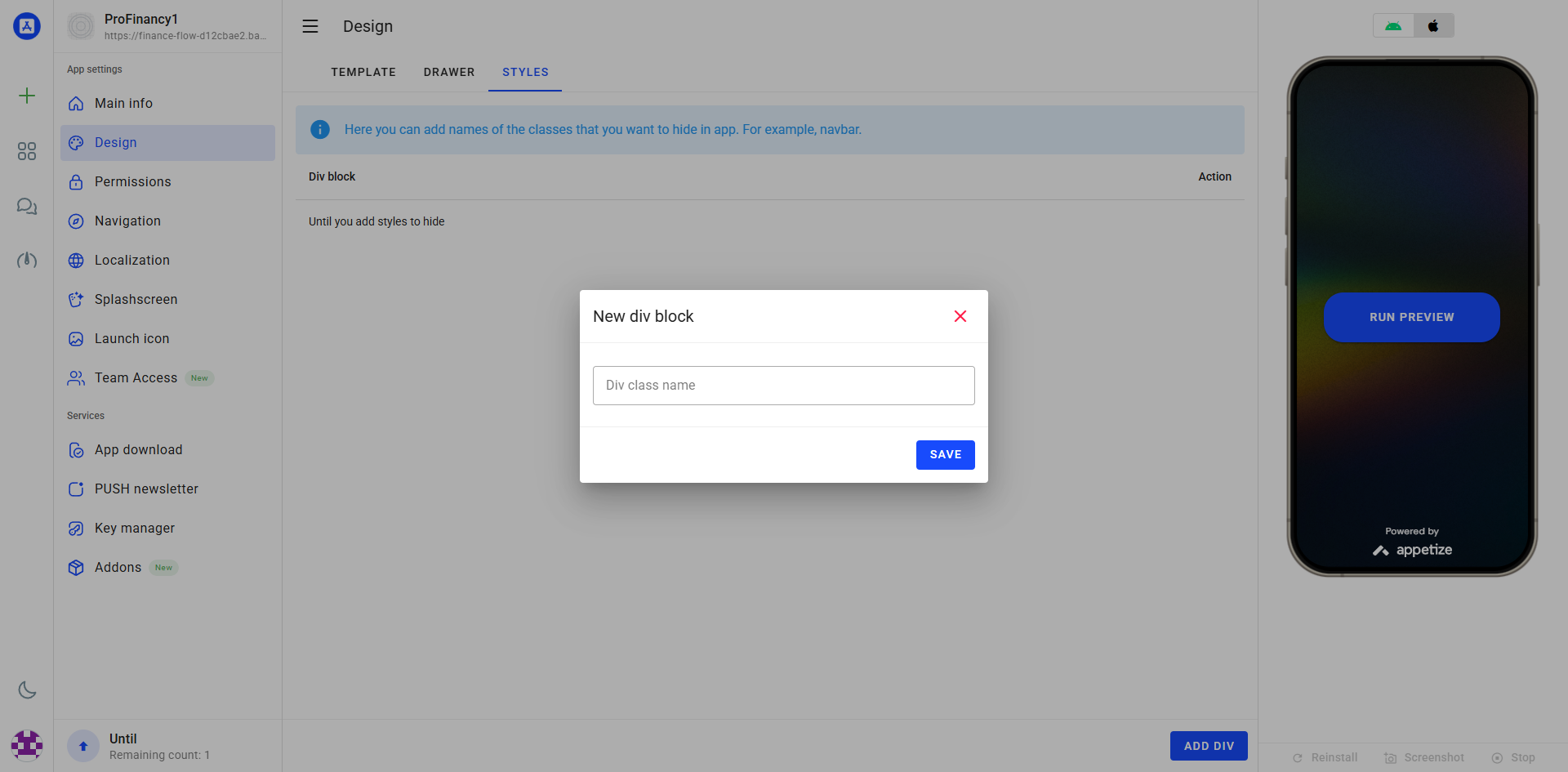
Styles (Hide CSS Classes)
Use this section to hide desktop-only elements inside the mobile app.
This is useful when your website has headers, banners, or sidebars that don’t look good on mobile.
.navbar, .footer
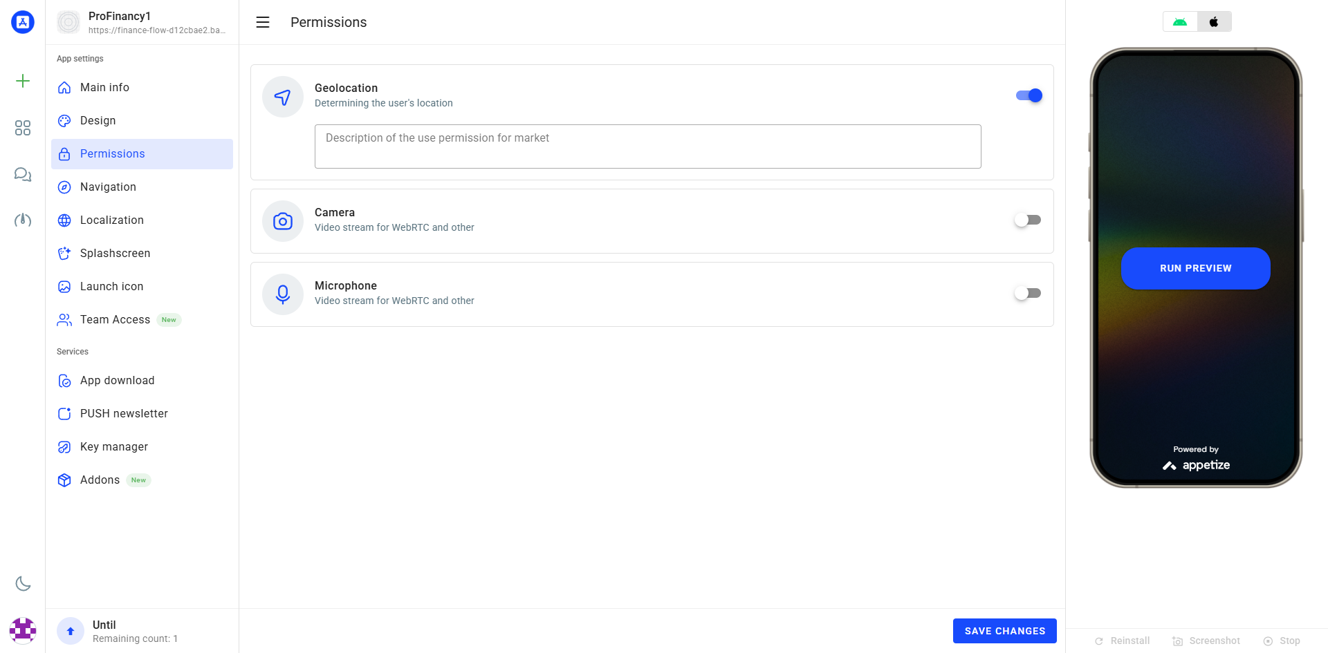
Permissions
Mobile apps can access device features like camera, GPS, and storage. Only enable permissions that your website actually uses - requesting unnecessary permissions may cause your app to be rejected by the app stores.
📍 Location (GPS)
Maps, store locators, delivery tracking
📷 Camera
Photo uploads, QR scanning, video calls
🎤 Microphone
Voice messages, video calls
📁 Storage
File downloads, uploads
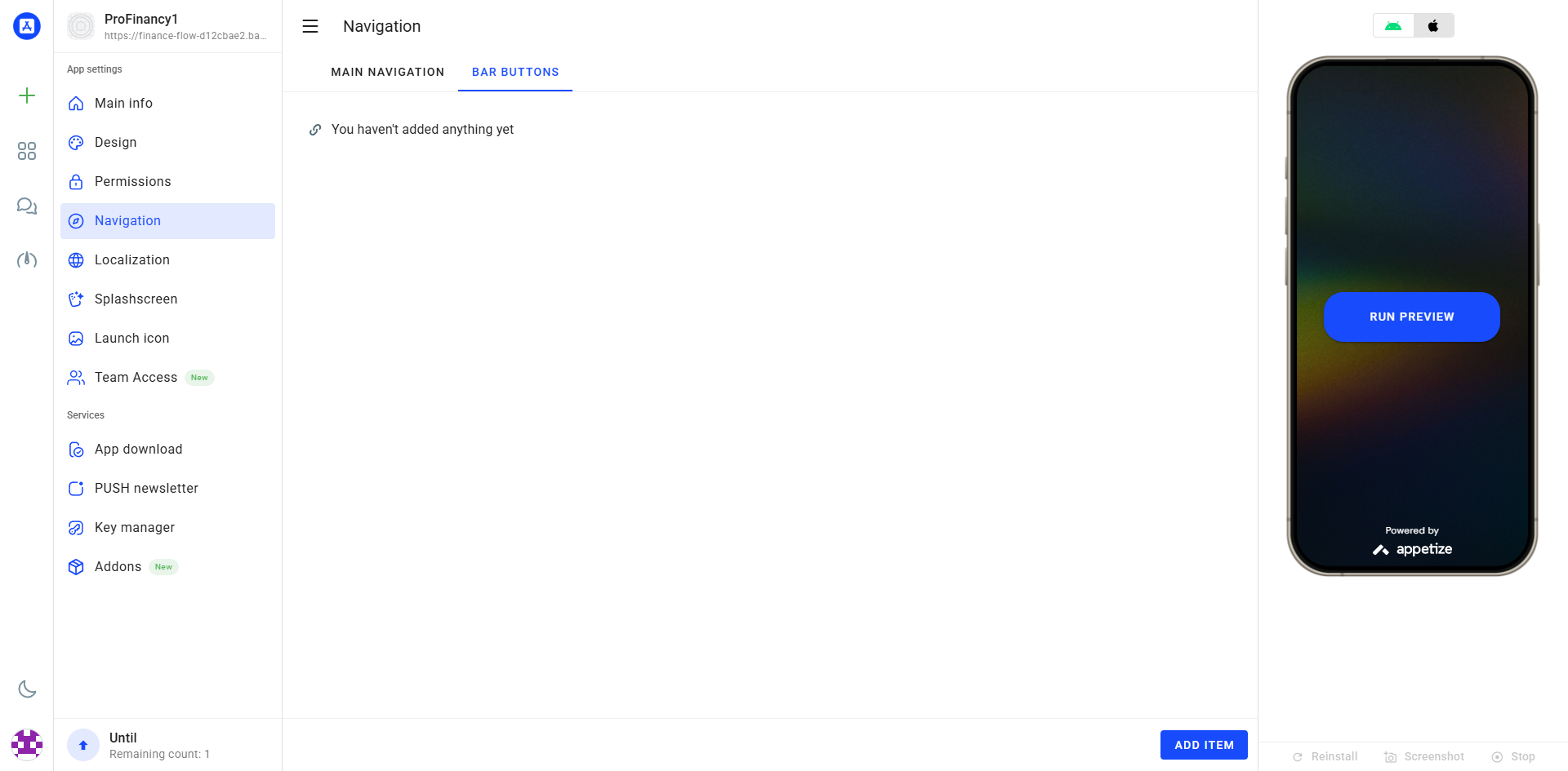
Navigation
Navigation controls how users move around your app. Add buttons to the bottom bar for quick access to important pages, or customize the drawer menu for more options. The navigation style depends on the template you chose in Design.
Bottom Bar
Add up to 5 buttons in the bottom navigation bar.
➕ Add Button
Click "ADD TAB"
🏠 Button Settings
Title, URL, icon
🔄 Reorder
Drag to change order
🗑️ Delete
Click trash icon
Add menu items to the side drawer (only works with Drawer template).
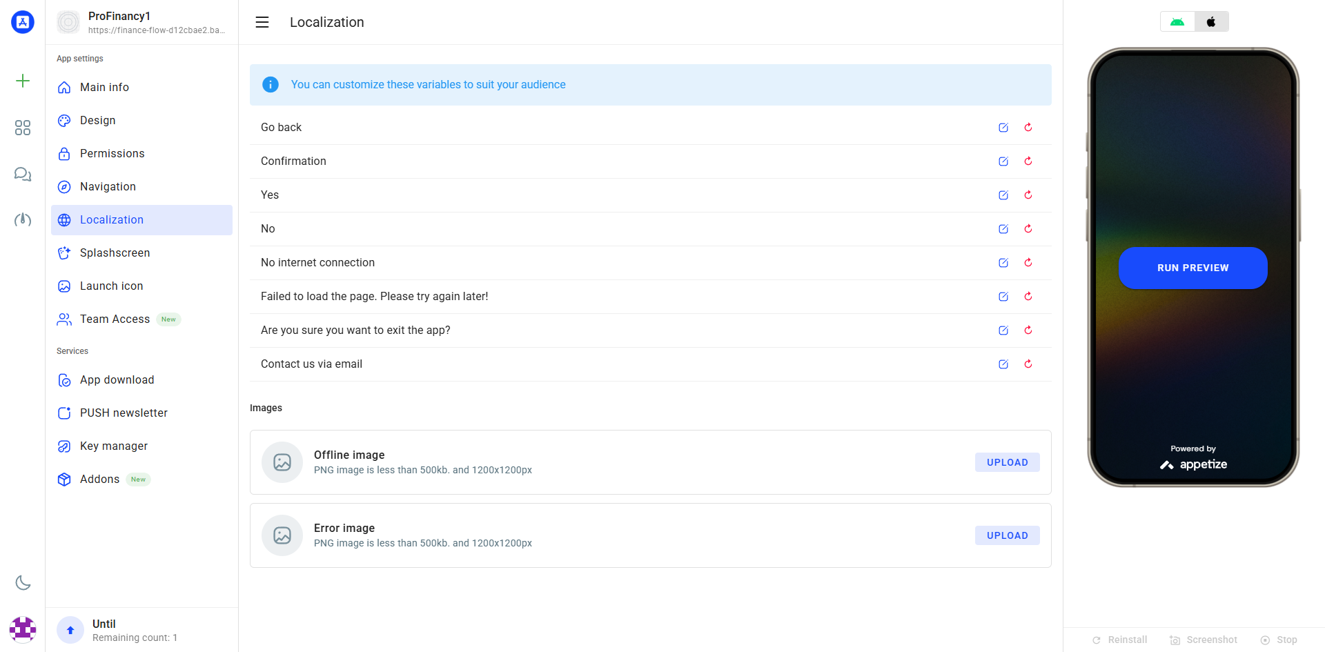
Localization
Localization controls the system messages in your app - buttons like "Back", "Forward", "Yes", "No", "Confirmation", and error messages. This is different from your website content, which will appear in your website's language. Choose the ISO code that matches your target audience.
🌍 System Language
ISO code for system UI (EN, ES, HE, AR, FR, DE, etc.)
📝 RTL Support
Automatically enabled for RTL languages like Hebrew and Arabic
💬 What's Localized?
Navigation buttons, system alerts, error messages, confirmation dialogs
🌐 Website Content
Your website content appears in your website's language, not this setting
If you set EN (English), the "Go Back" button will say "Back". If you set HE (Hebrew), it will say "חזור". Your website content remains in your website's language.
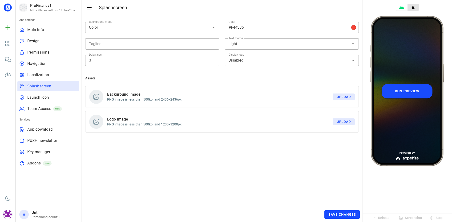
Splashscreen
The splash screen is the first thing users see when they open your app. It displays briefly while the app loads. Use your brand logo or a simple design that represents your business for a professional first impression.
🖼️ Background Image
1920×1920px PNG, max 500KB
🎨 Background Color
Fallback color if no image
📌 Logo
Optional centered logo
⏱️ Duration
How long splash shows (seconds)
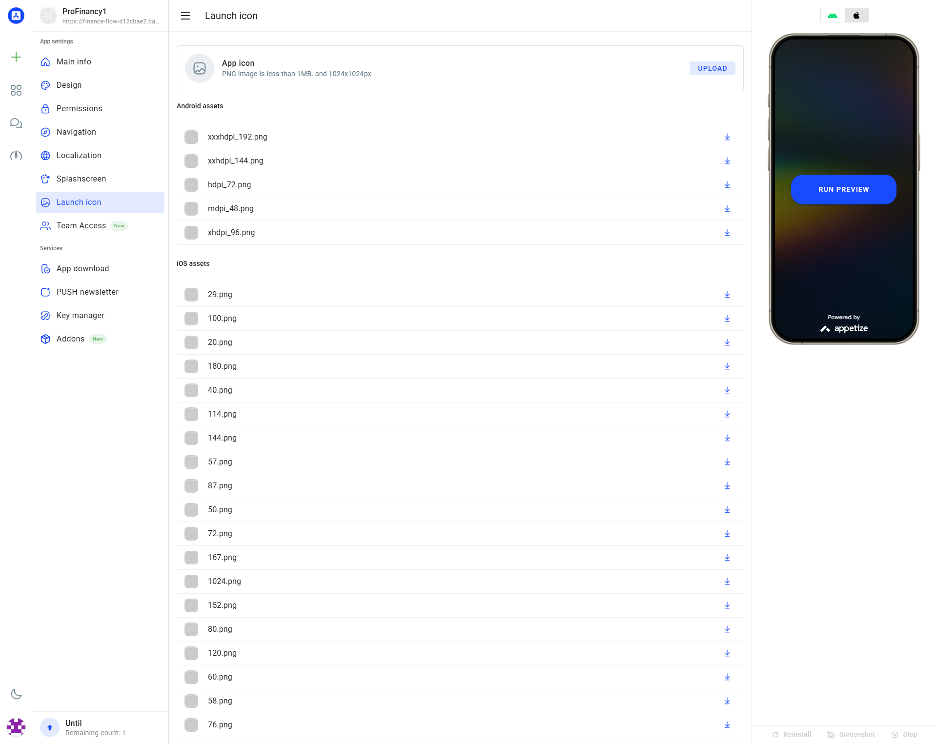
Launch Icon
The launch icon is what users tap to open your app. It appears on their home screen, in app stores, and in system menus. A well-designed icon helps users find your app and creates a professional impression.
📏 Size
1024×1024 pixels exactly
📄 Format
PNG only, solid background (no transparency)
📦 File Size
Maximum 1MB
🎨 Design Tips
Simple, recognizable at small sizes
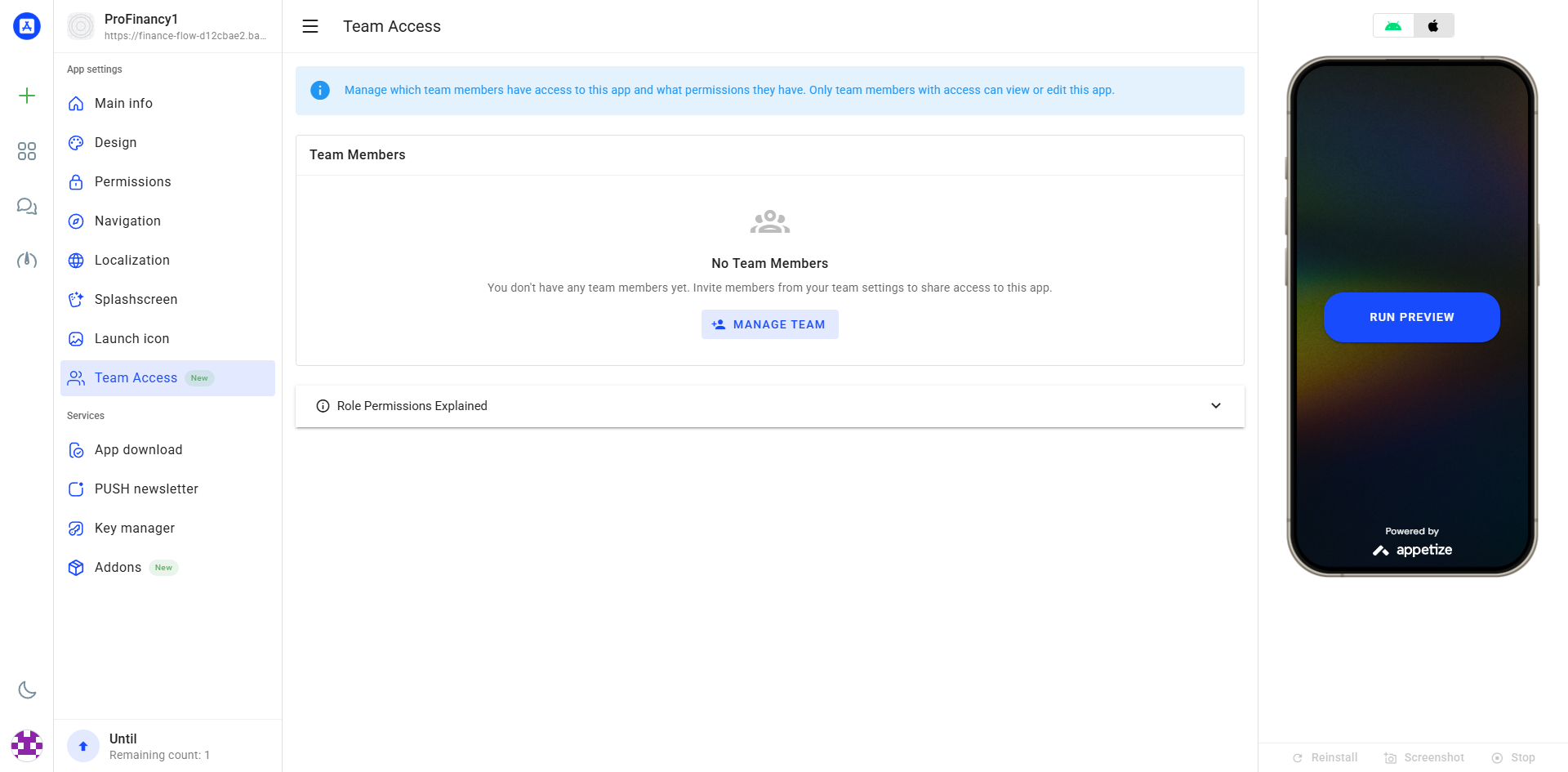
Team Access
Share access to your app with team members, developers, or clients. Each team member can view and edit app settings based on their permission level. You remain the owner and can remove access at any time.
👥 Invite Members
Add team members by email address.
🔐 Access Levels
Set permissions for each team member.
🗑️ Remove Access
Remove team members at any time.